A Second Design Proposal
Mon, May 28, 2018A few days ago I submitted a first stab at a redesign for a local charity. As expected, this was way too much of a change. I learned quickly that a basic round of discussion is needed before jumping into a project. I’m still happy I practiced on the last design, but it turns out they’re looking for more of a clean, expected look. So, I ran with a look you might find in most charity templates.
One additional thought to note – this time, I did a super quick iteration. Less than 3 hours total. I want to do a bunch of small iterations with them now until I know I’m on the right track. Then, the details can follow.
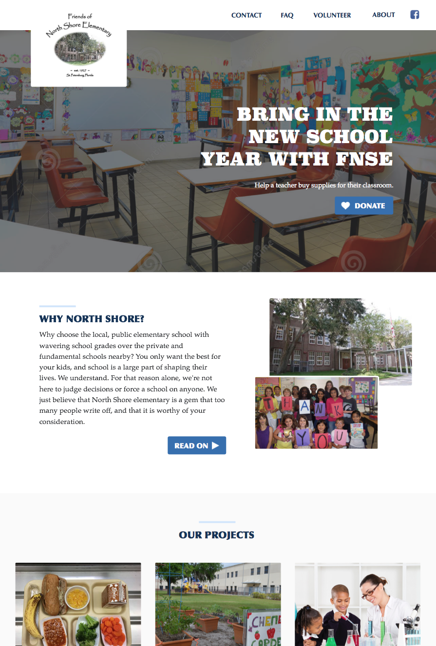
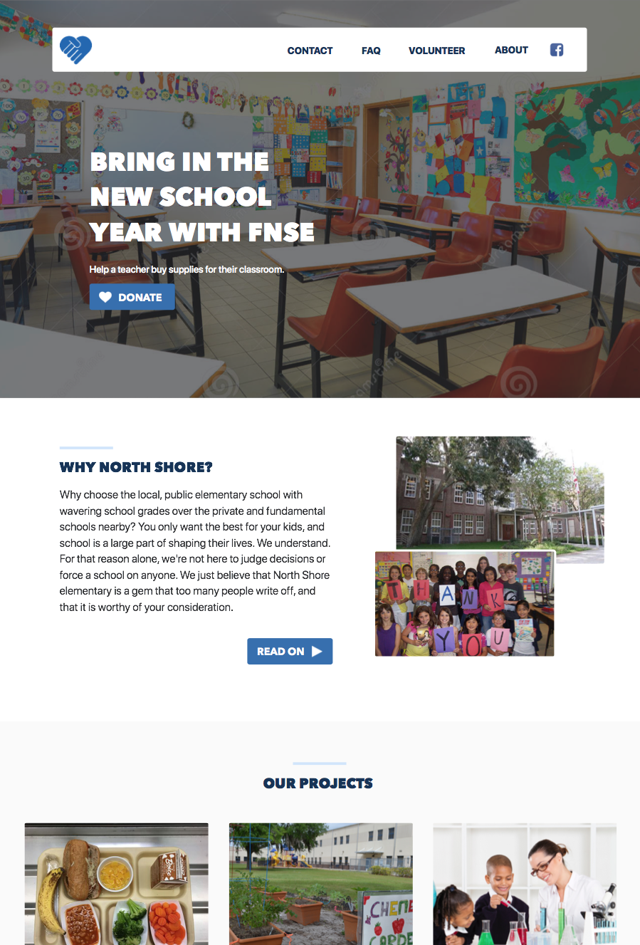
Actually, there is a second note too – they want me to try to keep their existing logo, which isn’t too design friendly. I gave them two versions of the design. One with a stolen modern logo as an example, and one with their current logo. We’ll see how the feedback goes this time around.
Cleaner logo and fonts.
Older logo and somewhat matching fonts.